Become a Data Visualization Whiz with this Comprehensive Guide to Seaborn in Python
Overview
- Seaborn is a popular data visualization library for Python
- Seaborn combines aesthetic appeal and technical insights – two crucial cogs in a data science project
- Learn how it works and the different plots you can generate using seaborn
Introduction
There is just something extraordinary about a well-designed visualization. The colors stand out, the layers blend nicely together, the contours flow throughout, and the overall package not only has a nice aesthetic quality, but it provides meaningful insights to us as well.
This is quite important in data science where we often work with a lot of messy data. Having the ability to visualize it is critical for a data scientist. Our stakeholders or clients will more often than not rely on visual cues rather than the intricacies of a machine learning model.
There are plenty of excellent Python visualization libraries available, including the built-in matplotlib. But seaborn stands out for me. It combines aesthetic appeal seamlessly with technical insights, as we’ll soon see.

In this article, we’ll learn what seaborn is and why you should use it ahead of matplotlib. We’ll then use seaborn to generate all sorts of different data visualizations in Python. So put your creative hats on and let’s get rolling!
Seaborn is part of the comprehensive and popular Applied Machine Learning course. It’s your one-stop-destination to learning all about machine learning and its different aspects.
Table of Contents
- What is Seaborn?
- Why should you use Seaborn versus matplotlib?
- Setting up the Environment
- Data Visualization using Seaborn
- Visualizing Statistical Relationships
- Plotting with Categorical Data
- Visualizing the Distribution of a Dataset
What is Seaborn?
Have you ever used the ggplot2 library in R? It’s one of the best visualization packages in any tool or language. Seaborn gives me the same overall feel.
Seaborn is an amazing Python visualization library built on top of matplotlib.
It gives us the capability to create amplified data visuals. This helps us understand the data by displaying it in a visual context to unearth any hidden correlations between variables or trends that might not be obvious initially. Seaborn has a high-level interface as compared to the low level of Matplotlib.
Why should you use Seaborn versus matplotlib?
I’ve been talking about how awesome seaborn is so you might be wondering what all the fuss is about.
I’ll answer that question comprehensively in a practical manner when we generate plots using seaborn. For now, let’s quickly talk about how seaborn feels like it’s a step above matplotlib.
Seaborn makes our charts and plots look engaging and enables some of the common data visualization needs (like mapping color to a variable or using faceting). Basically, it makes the data visualization and exploration easy to conquer. And trust me, that is no easy task in data science.
“If Matplotlib “tries to make easy things easy and hard things possible”, seaborn tries to make a well-defined set of hard things easy too.” – Michael Waskom (Creator of Seaborn)
There are essentially a couple of (big) limitations in matplotlib that Seaborn fixes:
- Seaborn comes with a large number of high-level interfaces and customized themes that matplotlib lacks as it’s not easy to figure out the settings that make plots attractive
- Matplotlib functions don’t work well with dataframes, whereas seaborn does
That second point stands out in data science since we work quite a lot with dataframes. Any other reason(s) you feel seaborn is superior to matplotlib? Let us know in the comments section below the article!
Setting up the Environment
The seaborn library has four mandatory dependencies you need to have:
- NumPy (>= 1.9.3)
- SciPy (>= 0.14.0)
- matplotlib (>= 1.4.3)
- Pandas (>= 0.15.2)
To install Seaborn and use it effectively, first, we need to install the aforementioned dependencies. Once this step is done, we are all set to install Seaborn and enjoy its mesmerizing plots. To install Seaborn, you can use the following line of code-
To install the latest release of seaborn, you can use pip:
pip install seaborn
You can also use conda to install the latest version of seaborn:
conda install seaborn
To import the dependencies and seaborn itself in your code, you can use the following code-
That’s it! We are all set to explore seaborn in detail.
Datasets Used for Data Visualization
We’ll be working primarily with two datasets:
I’ve picked these two because they contain a multitude of variables so we have plenty of options to play around with. Both these datasets also mimic real-world scenarios so you’ll get an idea of how data visualization and exploration work in the industry.
You can check out this and other high-quality datasets and hackathons on the DataHack platform. So go ahead and download the above two datasets before you proceed. We’ll be using them in tandem.
Data Visualization using Seaborn
Let’s get started! I have divided this implementation section into two categories:
- Visualizing statistical relationships
- Plotting categorical data
We’ll look at multiple examples of each category and how to plot it using seaborn.
Visualizing statistical relationships
A statistical relationship denotes a process of understanding relationships between different variables in a dataset and how that relationship affects or depends on other variables.
Here, we’ll be using seaborn to generate the below plots:
- Scatter plot
- SNS.relplot
- Hue plot
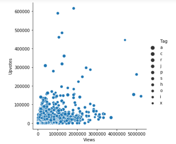
I have picked the ‘Predict the number of upvotes‘ project for this. So, let’s start by importing the dataset in our working environment:
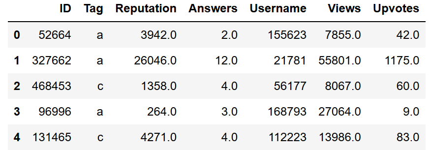
Scatterplot using Seaborn
A scatterplot is perhaps the most common example of visualizing relationships between two variables. Each point shows an observation in the dataset and these observations are represented by dot-like structures. The plot shows the joint distribution of two variables using a cloud of points.
To draw the scatter plot, we’ll be using the relplot() function of the seaborn library. It is a figure-level role for visualizing statistical relationships. By default, using a relplot produces a scatter plot:
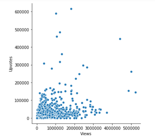
SNS.relplot using Seaborn
SNS.relplot is the relplot function from SNS class, which is a seaborn class that we imported above with other dependencies.
The parameters – x, y, and data – represent the variables on X-axis, Y-axis and the data we are using to plot respectively. Here, we’ve found a relationship between the views and upvotes.
Next, if we want to see the tag associated with the data, we can use the below code:
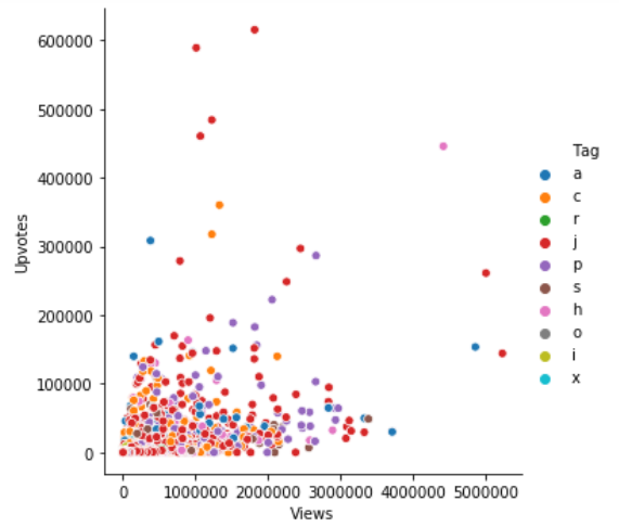
Hue Plot
We can add another dimension in our plot with the help of hue as it gives color to the points and each color has some meaning attached to it.
In the above plot, the hue semantic is categorical. That’s why it has a different color palette. If the hue semantic is numeric, then the coloring becomes sequential.
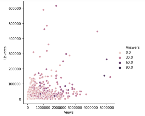
We can also change the size of each point:
We can also change the size manually by using another parameter sizes as sizes = (15, 200).
Plotting Categorical Data
- Jitter
- Hue
- Boxplot
- Voilin Plot
- Pointplot
In the above section, we saw how we can use different visual representations to show the relationship between multiple variables. We drew the plots between two numeric variables. In this section, we’ll see the relationship between two variables of which one would be categorical (divided into different groups).
We’ll be using catplot() function of seaborn library to draw the plots of categorical data. Let’s dive in
Jitter Plot
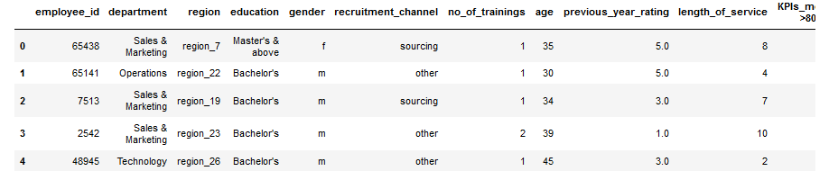
For jitter plot we’ll be using another dataset from the problem HR analysis challenge, let’s import the dataset now.
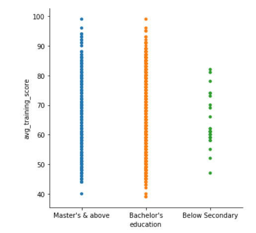
Now, we’ll see the plot between the columns education and avg_training_score by using catplot() function.
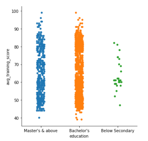
Since we can see that the plot is scattered, so to handle that, we can set the jitter to false. Jitter is the deviation from the true value. So, we’ll set the jitter to false by using another parameter.
Hue Plot
Next, if we want to introduce another variable or another dimension in our plot, we can use the hue parameter just like we used in the above section. Let’s say we want to see the gender distribution in the plot of education and avg_training_score, to do that, we can use the following code
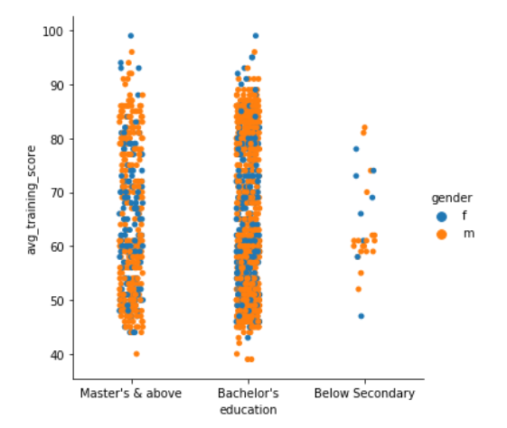
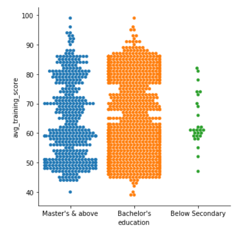
In the above plots, we can see that the points are overlapping each other, to eliminate this situation, we can set kind = “swarm”, swarm uses an algorithm that prevents the points from overlapping and adjusts the points along the categorical axis. Let’s see how it looks like-
Pretty amazing, right? What if we want to see the swarmed version of the plot as well as a third dimension? Let’s see how it goes if we introduce is_promoted as a new variable
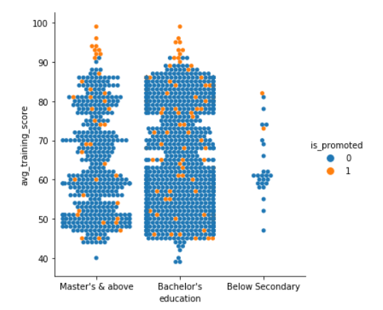
Clearly people with higher scores got a promotion.
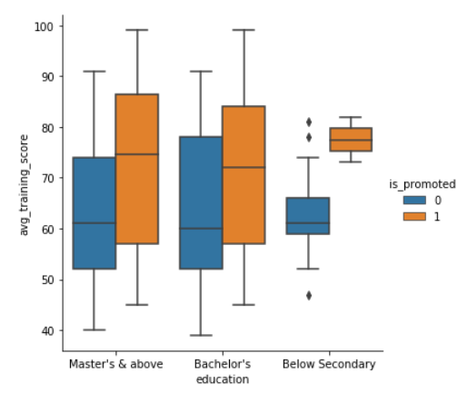
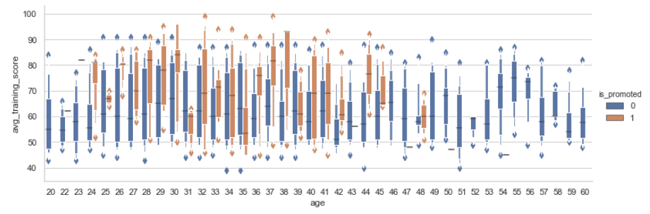
Boxplot using seaborn
Another kind of plot we can draw is a boxplot which shows three quartile values of the distribution along with the end values. Each value in the boxplot corresponds to actual observation in the data. Let’s draw the boxplot now-
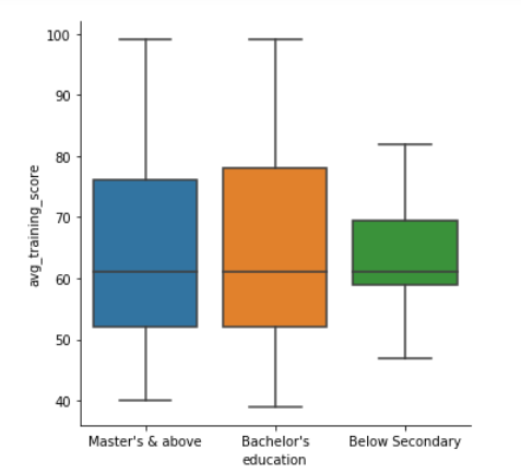
When we use hue semantic with boxplot, it is leveled along the categorical axis so they don’t overlap. The boxplot with hue would look like-
Violin Plot using seaborn
We can also represent the above variables differently by using violin plots. Let’s try it out
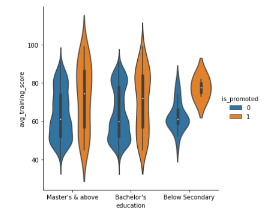
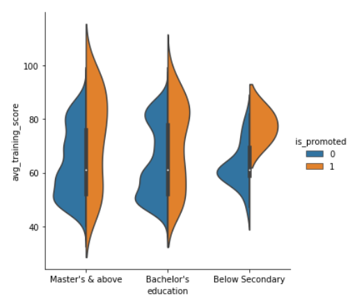
The violin plots combine the boxplot and kernel density estimation procedure to provide richer description of the distribution of values. The quartile values are displayed inside the violin. We can also split the violin when the hue semantic parameter has only two levels, which could also be helpful in saving space on the plot. Let’s look at the violin plot with a split of levels.
These amazing plots are the reason why I started using seaborn. It gives you a lot of options to display the data. Another coming in the line is boxplot.
Boxplot using seaborn
Boxplot operates on the full dataset and obtains the mean value by default. Let’s face it now.
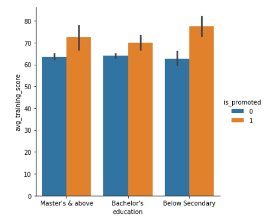
Pointplot using seaborn
Another type of plot coming in is pointplot, and this plot points out the estimate value and confidence interval. Pointplot connects data from the same hue category. This helps in identifying how the relationship is changing in a particular hue category. You can check out how does a pointplot displays the information below.
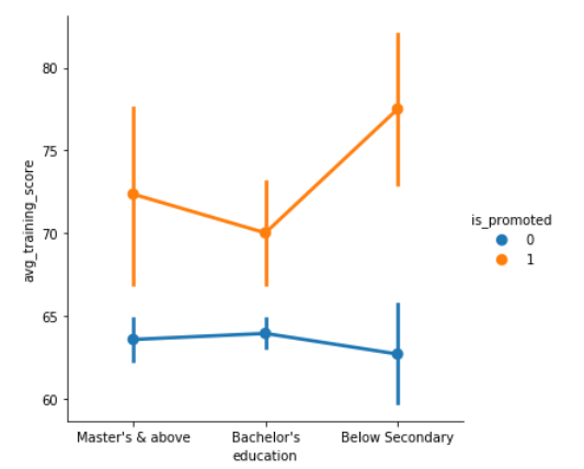
As it is clear from the above plot, the one whose score is high has is more confident in getting a promotion.
This is not the end, seaborn is a huge library with a lot of plotting functions for different purposes. One such purpose is to introduce multiple dimensions. We can visualize higher dimension relationships as well. Let’s check it out using swarm plot.
Swarm plot using seaborn
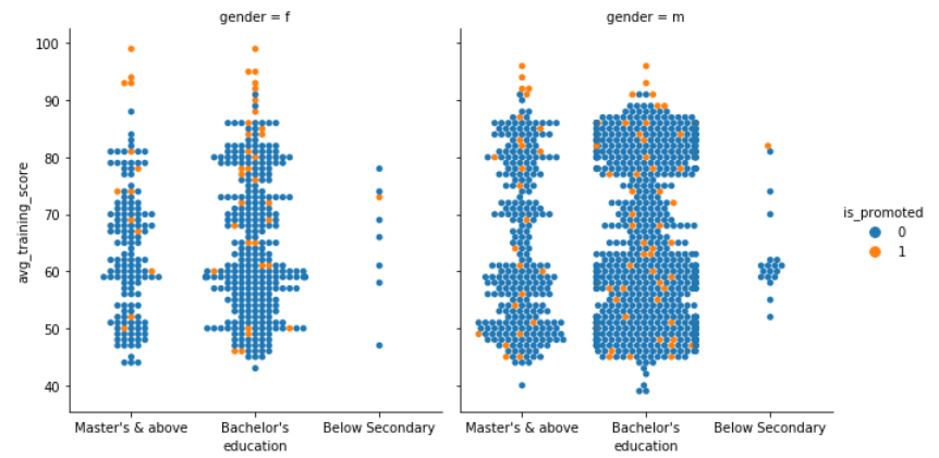
It becomes so easy to visualize the insights when we combine multiple concepts into one. Here swarm plot is promoted attribute as hue semantic and gender attribute as a faceting variable.
Visualizing the Distribution of a Dataset
Whenever we are dealing with a dataset, we want to know how the data or the variables are being distributed. Distribution of data could tell us a lot about the nature of the data, so let’s dive into it.
Plotting Univariate Distributions
- Histogram
One of the most common plots you’ll come across while examining the distribution of a variable is distplot. By default, distplot() function draws histogram and fits a Kernel Density Estimate. Let’s check out how age is distributed across the data.
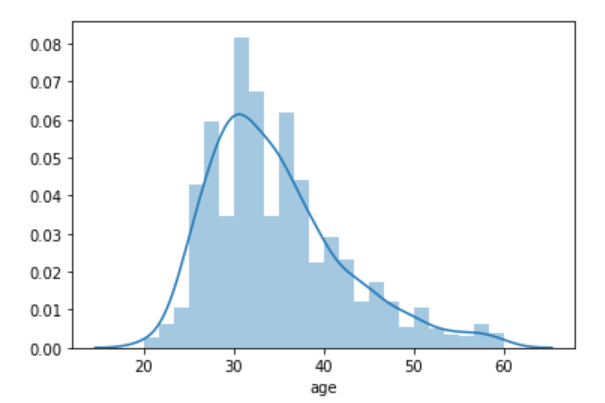
This clearly shows that the majority of people are in their late twenties and early thirties.
Histogram using Seaborn
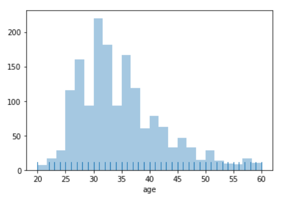
Another kind of plot that we use for univariate distribution is a histogram.
A histogram represents the distribution of data in the form of bins and uses bars to show the number of observations falling under each bin. We can also add a rugplot in it instead of using KDE (Kernel Density Estimate), which means at every observation, it will draw a small vertical stick.
Plotting Bivariate Distributions
- Hexplot
- KDE plot
- Boxen plot
- Ridge plot (Joyplot)
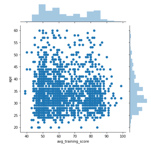
Apart from visualizing the distribution of a single variable, we can see how two independent variables are distributed with respect to each other. Bivariate means joint, so to visualize it, we use jointplot() function of seaborn library. By default, jointplot draws a scatter plot. Let’s check out the bivariate distribution between age and avg_training_score.
There are multiple ways to visualize bivariate distribution. Let’s look at a couple of more.
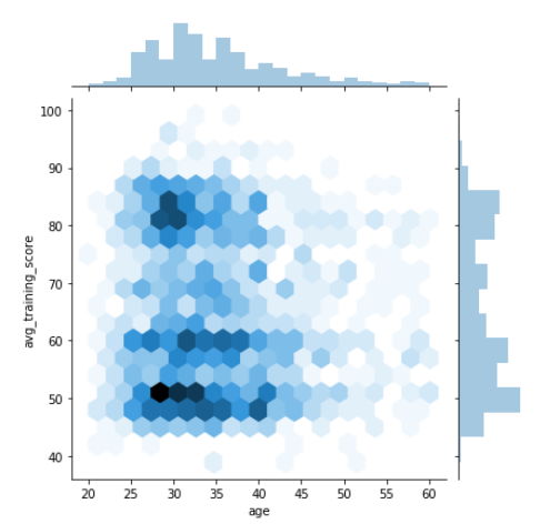
Hexplot using Seaborn
Hexplot is a bivariate analog of histogram as it shows the number of observations that falls within hexagonal bins. This is a plot which works with large dataset very easily. To draw a hexplot, we’ll set kind attribute to hex. Let’s check it out now.
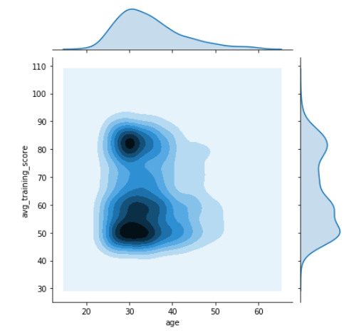
KDE Plot using Seaborn
That’s not the end of this, next comes KDE plot. It’s another very awesome method to visualize the bivariate distribution. Let’s see how the above observations could also be achieved by using jointplot() function and setting the attribute kind to KDE.
Heatmaps using Seaborn
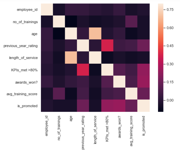
Now let’s talk about my absolute favorite plot, the heatmap. Heatmaps are graphical representations in which each variable is represented as a color.
Let’s go ahead and generate one:
Boxen Plot using Seaborn
Another plot that we can use to show the bivariate distribution is boxen plot. Boxen plots were originally named letter value plot as it shows large number of values of a variable, also known as quantiles. These quantiles are also defined as letter values. By plotting a large number of quantiles, provides more insights about the shape of the distribution. These are similar to box plots, let’s see how they could be used.
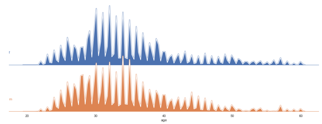
Ridge Plot using seaborn
The next plot is quite fascinating. It’s called ridge plot. It is also called joyplot. Ridge plot helps in visualizing the distribution of a numeric value for several groups. These distributions could be represented by using KDE plots or histograms. Now, let’s try to plot a ridge plot for age with respect to gender.
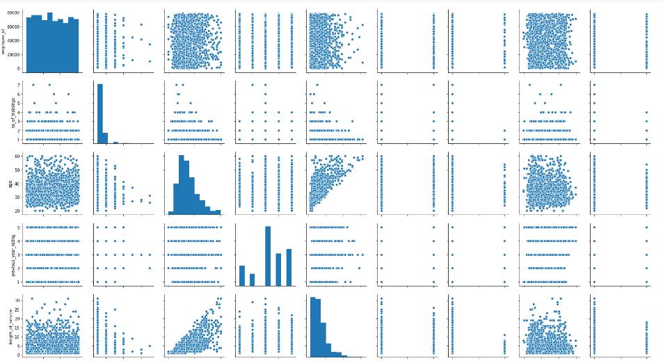
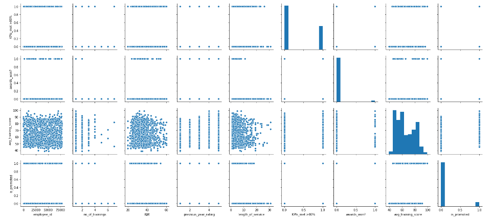
Visualizing Pairwise Relationships in a Dataset
We can also plot multiple bivariate distributions in a dataset by using pairplot() function of the seaborn library. This shows the relationship between each column of the database. It also draws the univariate distribution plot of each variable on the diagonal axis. Let’s see how it looks.
End Notes
We’ve covered a lot of plots here. We saw how the seaborn library can be so effective when it comes to visualizing and exploring data (especially large datasets). We also discussed how we can plot different functions of the seaborn library for different kinds of data.
Like I mentioned earlier, the best way to learn seaborn (or any concept or library) is by practicing it. The more you generate new visualizations on your own, the more confident you’ll become. Go ahead and try your hand at any practice problem on the DataHack platform and start becoming a data visualization master!


very handy guide, Thanks for sharing.